Grab a coffee and scroll on down through my folio of product design & branding work.

MY FAVOURITE IS A CHAILATTE...
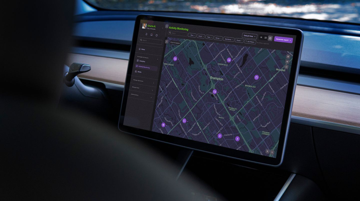
TELUS - MERGING TWO FLEET PLATFORMS INTO ONE MODERN, DATA-DRIVEN EXPERIENCE
About the product
While working as a senior product designer at Block Zero in Malmö, I was part of an embedded team helping a major North American telecommunications company consolidate two powerful fleet management products into a single, easier-to-use platform.
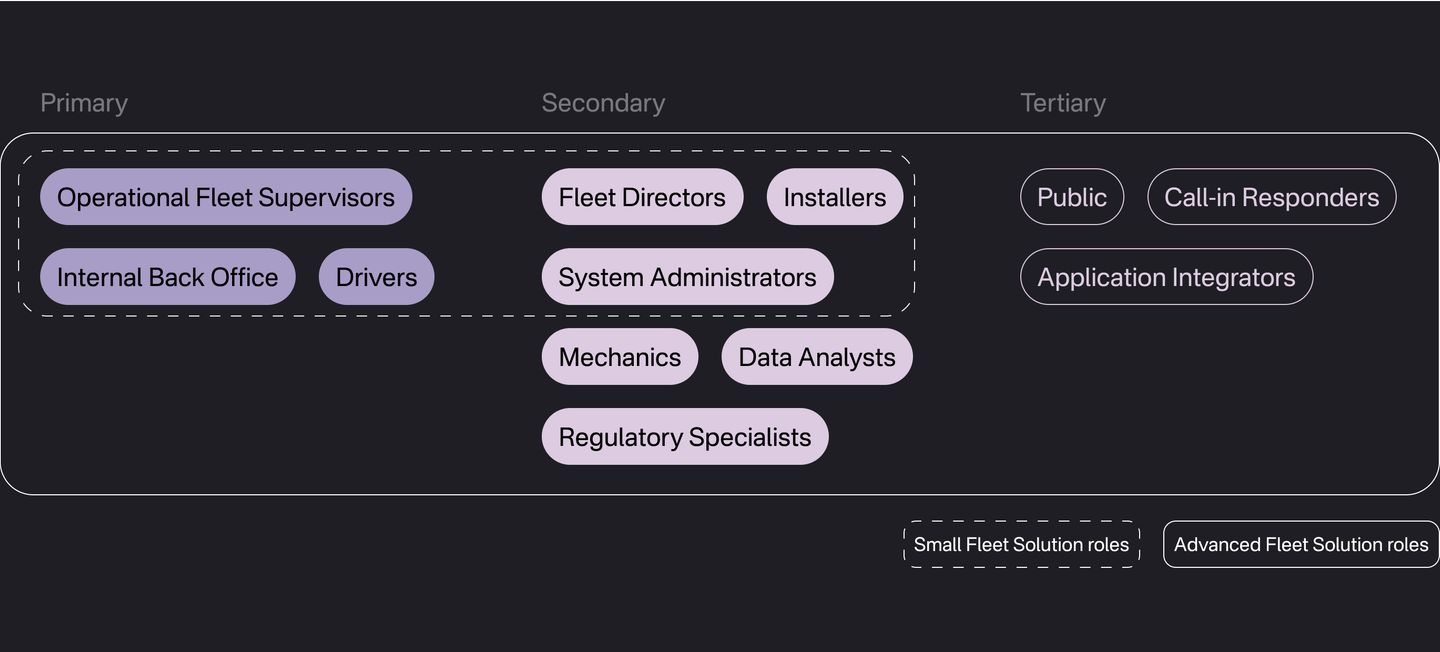
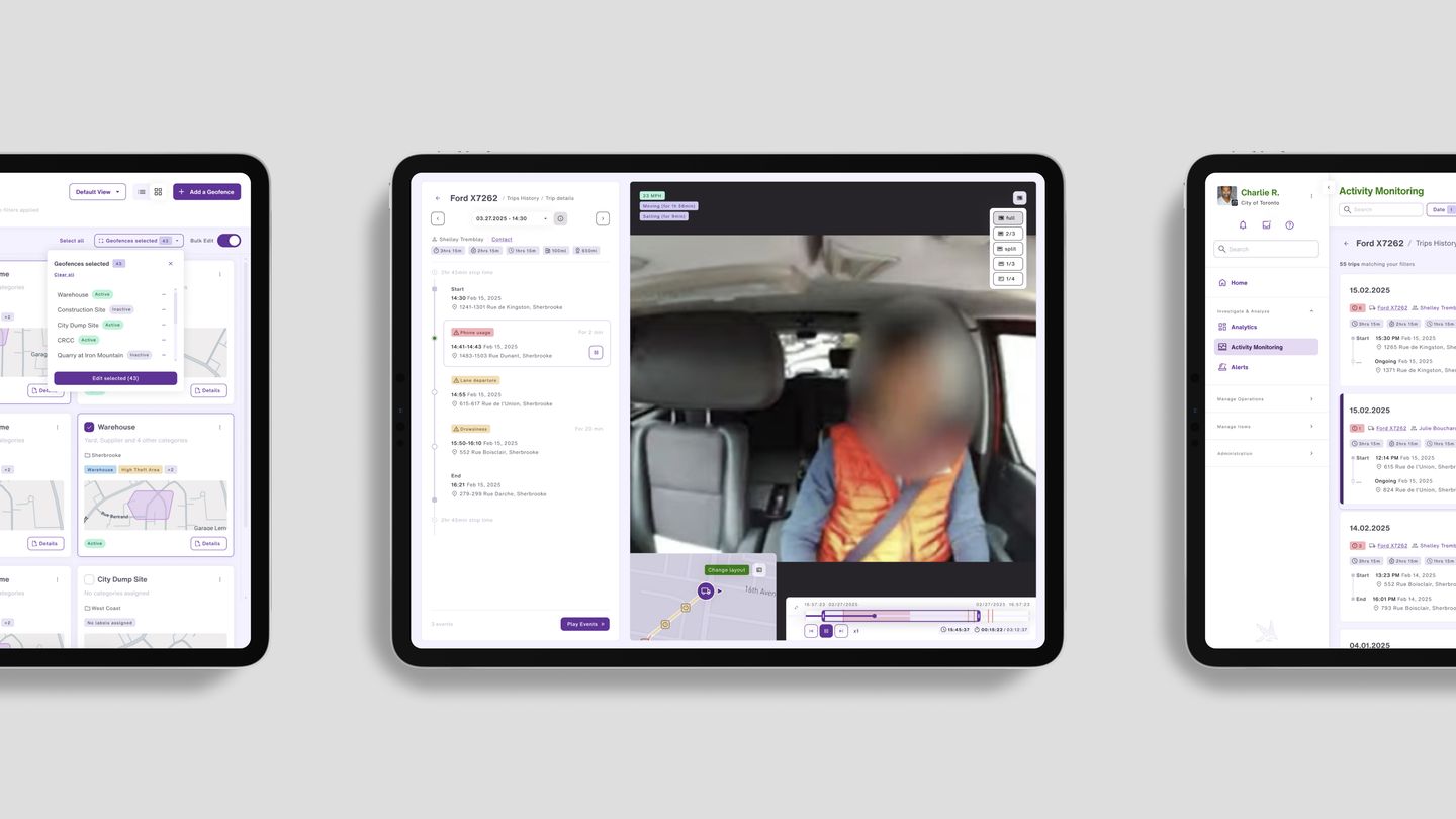
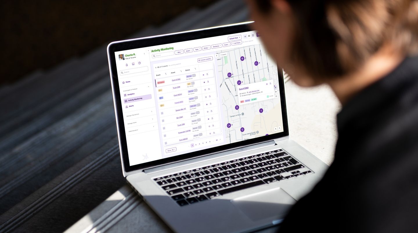
Fleet software sits at the centre of how organizations track mobile and stationary assets in real time: hardware such as GPS trackers, IoT sensors and cameras feeds telematics data into the product, supporting everything from route planning and compliance to day-to-day operations for fleet managers, drivers and supervisors. The challenge was not only to unify two legacy experiences, but to make dense, live information feel clear and actionable at scale.
Design & process
My main contribution was on the telematics side of the product: shaping the latest flows for visualizing data from in-vehicle sensors and cameras so that signal from the field translated into interfaces fleet roles could trust and scan quickly. That meant working through how live map activity, alerts and historical views should sit alongside each other, and how we layered detail without overwhelming users who rely on the product throughout a shift.
I also authored the discussion guide and testing strategy for a qualitative user research study, and led the sessions with a group of municipal workers across different roles, each already familiar with one of the two fleet management systems we were merging. The aim was to optimise user journeys against real role needs and existing habits, so the merged product could build on what people already knew rather than fighting it.
Design decisions had to respect local constraints: GDPR-aligned data-protection expectations where they applied, together with Canadian privacy requirements and fleet-industry regulations that govern how telematics, location and camera-related data can be collected, stored and surfaced to different roles.
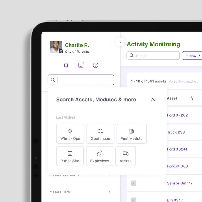
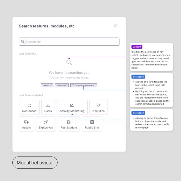
Early on we invested in mapping complexity together, building a shared picture of primary and secondary users, aligning on an MVP roadmap, and pairing closely with product and engineering as flows were broken into ship-ready packages. We also established a rigorous design system so that highly technical workflows stayed consistent as the platform grew, including patterns for light and dark contexts suited to different roles and environments.
Role & responsibility
Senior Product Designer at Block Zero / telematics & data visualization flows / sensor & camera data UI / qualitative study design (questions & testing strategy) & facilitated sessions with municipal fleet users / user flows, wireframes & prototypes / collaboration with product, engineering & client stakeholders / design system & UI patterns for complex B2B workflows / privacy & regulatory considerations (GDPR, Canadian fleet context)
The broader initiative combined strategic discovery with hands-on execution: heuristic reviews, competitive benchmarking and raising the bar for how user insight fed the roadmap. The case study on Block Zero walks through how we moved from mapping users and journeys to delivering core flows, front-end architecture and documentation, work that set the product up for a modern, user-centered foundation even as the wider program evolved.
Read the full case study on Block ZeroPLUVIO FLOW - A BRAND SYSTEM FOR SMARTER FLOOD MANAGEMENT
About the product
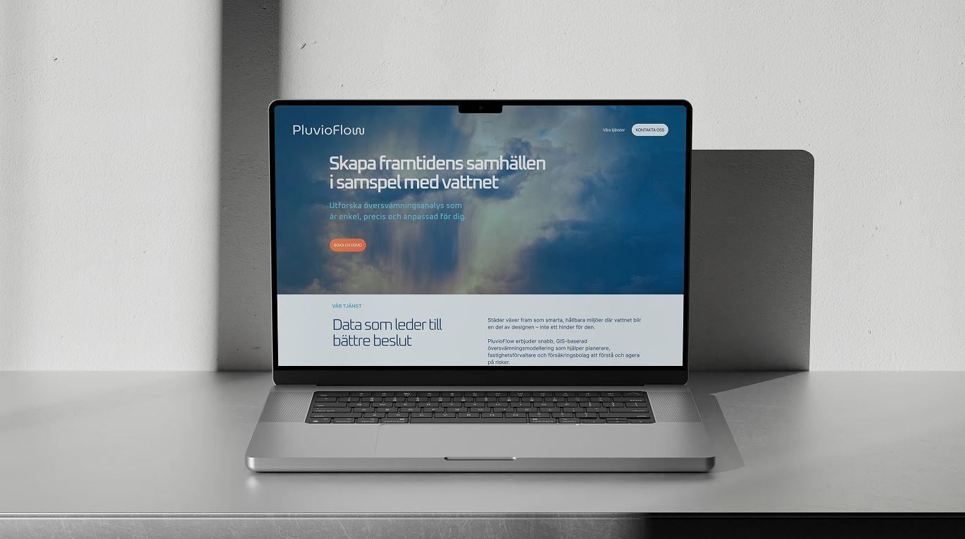
While at Block Zero in Malmö I was the senior designer on PluvioFlow, a climate-tech startup building next-generation hydrological modelling tools for municipalities, insurers and property owners who need to predict and mitigate flood risk. I led research, strategy, the brand system and UX/UI end to end: from understanding the competitive landscape and defining where PluvioFlow should sit in the market, through to visual identity, guidelines and how the product would show up in digital touchpoints.
The brief was to give them a strategic foundation that could unify messaging for a wide mix of stakeholders. I approached it by building on their existing product and market-fit work, then layering competitive analysis, personas and positioning before locking the story into a documented brand system. Workshops and iterative reviews with the client kept scientists and business leads aligned while the work stayed accessible without losing rigour. The narrative thread I co-created with another designer, using Block Zero's Narrative Process™, set an optimistic, proactive tone for how the brand talks about flood management, grounded in the science.
Design & process
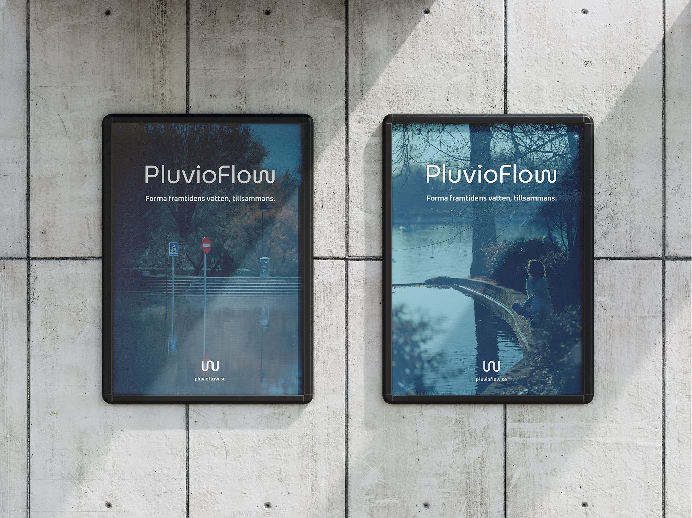
A lot of the grind was in the edges: how much hydrology belongs in a headline versus in a product screen, and where trust should come from tone versus proof. Investors, municipal buyers and technical users all needed to recognise the same company without reading the same paragraph, so I kept pushing for concrete trade-offs in copy and layout rather than a single generic “climate” gloss.
On the narrative track, my co-designer and I turned the strategy into something people could actually use: language pillars, voice traits and “say this / not this” examples so sales, product and marketing could share vocabulary. That gave the optimistic positioning a backbone: editorial rules, not only a mood.
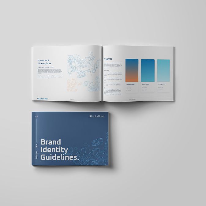
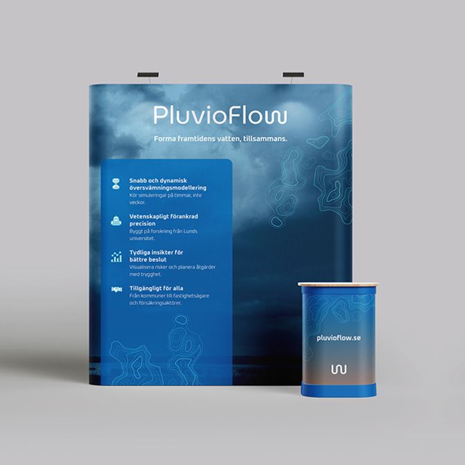
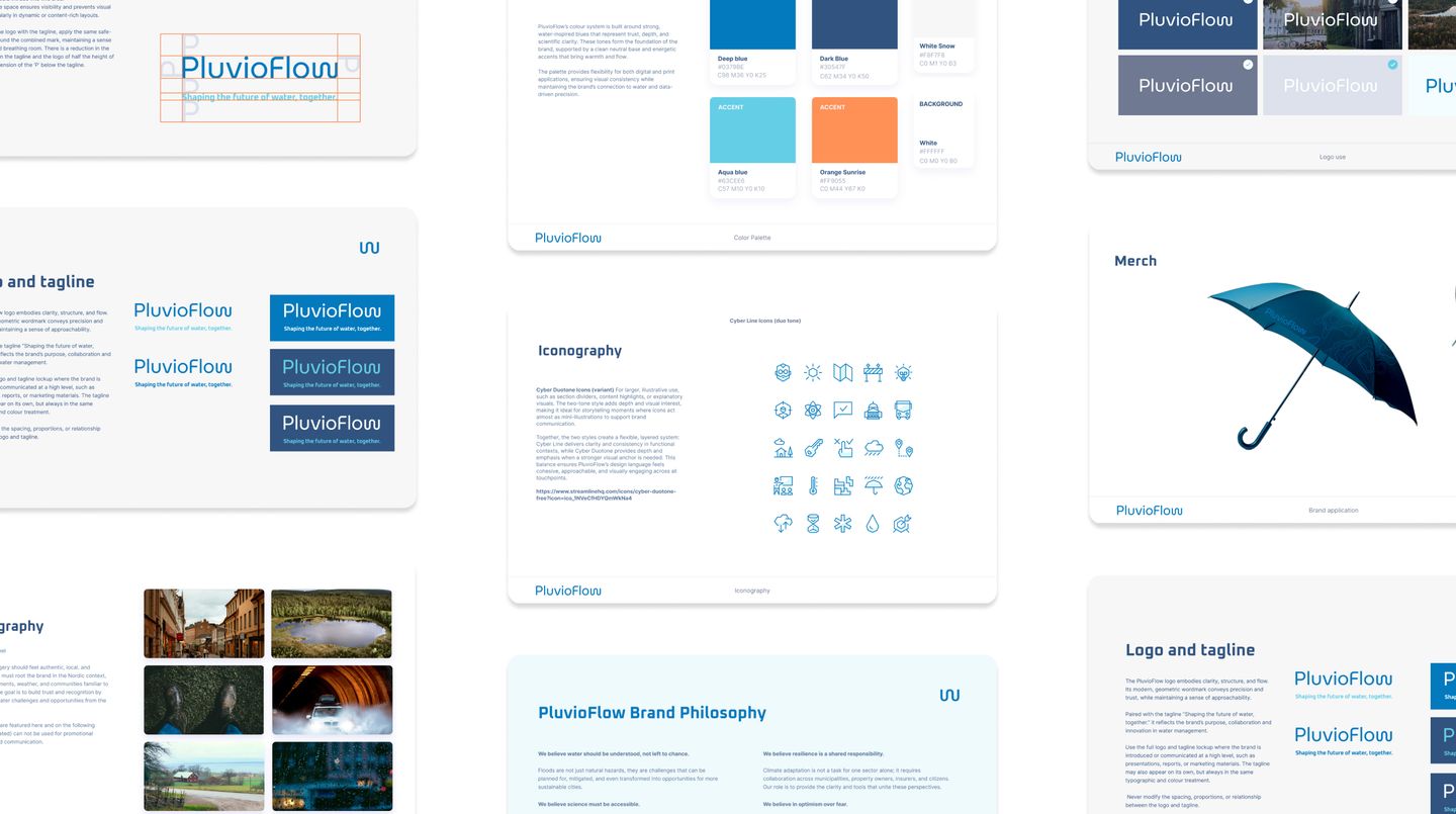
Visually I treated the system as operational, not decorative: logo lockups and clearspace, colour roles that still worked on data-heavy screens, typography that had to survive long reports and UI, photography direction that felt documentary rather than stock disaster imagery, and iconography that could sit next to model output without looking playful. The guidelines covered digital and print so external partners could implement without drifting.
UX/UI was where the brand had to prove itself, through interface explorations so the story matched what users would actually see in the product, plus scenario-based website and product messaging for different audiences. The positioning map became an ongoing filter: where competitors clustered, and where PluvioFlow could legitimately own precision, usability and scientific depth together.
Role & responsibility
Senior designer at Block Zero / research & strategy / brand system & UX/UI / narrative co-created with another designer / workshops & stakeholder alignment / messaging & communication / visual identity & guidelines / collaboration with client on complex science-to-brand translation
The project delivered a unified brand and communication framework so PluvioFlow can grow with clearer understanding among investors, customers and partners. The Block Zero case study expands on outcomes, testimonials and how the identity supports their roadmap.
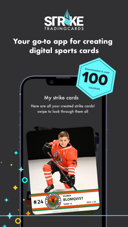
Read the full case study on Block ZeroSTRIKE TRADING CARDS - YOUR GO-TO APP FOR CREATING DIGITAL SPORTS CARDS
About the product
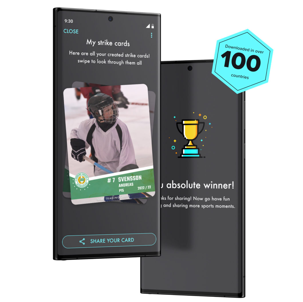
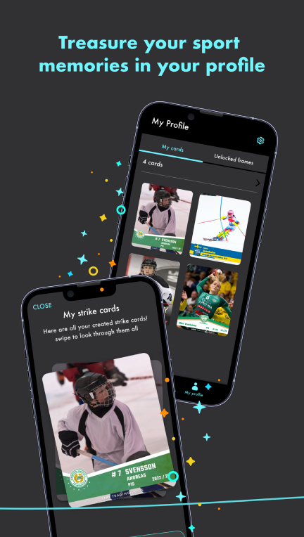
The Strike app allows you to quickly create personal trading cards where you, your friends, your team or your family, are the heroes.
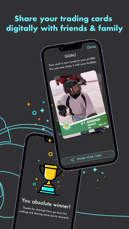
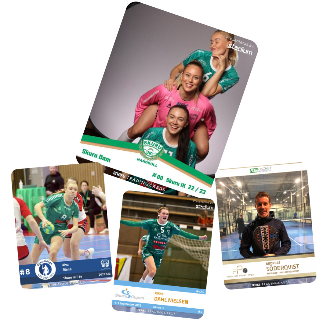
With a variety of different skins, you can easily create amazing trading cards matching your favourite sport and teams. Add information such as your name, number and team name. Save them on your phone and share the moments with your family, friends and teammates.

Design & process
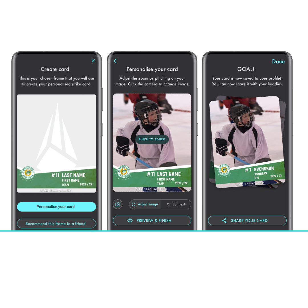
For the MVP we created a simple user flow that worked well for both the adult and youth audience to create the cards, allowing for players and teams as well as their proud parents to use the app. Based on the outcome of the research conducted with our focus groups we decided to start with skins that targeted ice hockey and team sports.
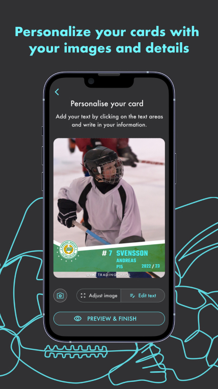
The UI design of the MVP was a simple 5 step process from photo capture to sharing on social media, all the focus is on the creation of the card and personalisation of the data. You can edit different inputs depending on the design of the skin, such as player name, club and player number and then a visual was generated in a format that suited both Instagram and Facebook.
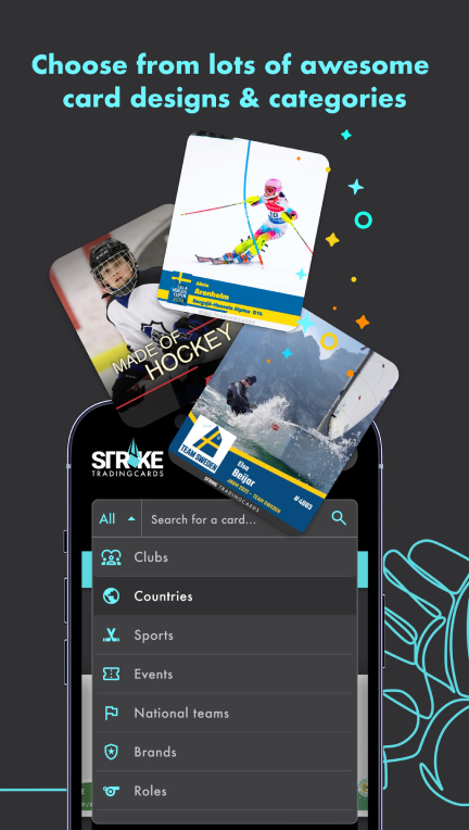
Since launch we have added further features such as a search for different card categories and have now included a larger selection of sports and clubs in the skins, you can also activate your local clubs skin with a code or easily scan a QR code to open a skin to start creating club specific cards.
When designing the android and iOS native apps’ primary features, the skins search filter and the Card studio (where you edit your skin to create your card) where custom designed but for the majority of the app UI we used stylised components from material 3 and iOS 17 design systems.
To create retention in the app there is the ‘my cards’ tab on your profile where you can look through your existing cards and keep and re-share your collection, similar to a collectors album effect. There is also a continuous update of new skins and a promotional ad space at the top of the card studio feature where you can see the newest or featured promoted card designs.
There is currently also a strong push for promotion both with our affiliate NHL players and national teams and local youth hockey leagues in Stockholm who have had custom skins and cards created.
The visual Identity
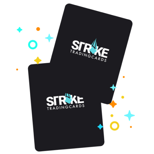
The brand identity is bold and impactful with its simple sans serif word mark and incorporated icon of a card in motion, with a visual nod towards the motion of sports and activating a racket, club, ball or bat. Since our target audience is a range from tweens and late teens to the parents, grandparents and coaches, we wanted the brand to be universal in its appeal to both adults & youngsters. So the combination of the bright colour pallet together with the more uniform typography creates a bold balance which allows for a strong colour equity as well as a stand out word mark.
We created a dark design with white and turquoise highlights to let the cards and images take centre stage. This was to prevent the brand colours from overpowering the diverse range of club colours and branding in digital brand touchpoint in the app and lend itself to collaboration and expansion into different sports, activities and partnerships.
Role & responsibility
Product Design Lead / Name creation / Brand design & development / UI & UX design native apps / wireframes / clickable prototypes / client and development team contact regarding design / pixel perfect figma files / style guides / visuals for appstore, googleplay, meta data / sendgrid email design (trigger mails) / UX copy for app
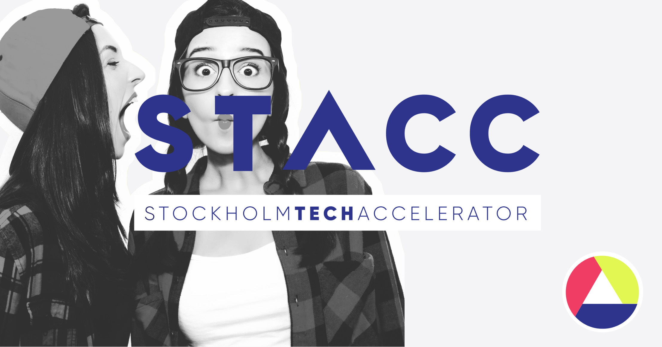
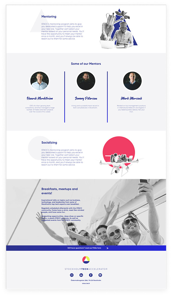
STACC - ACCELERATING TALENT & ORGANIZATIONS IN THE STOCKHOLM TECH INDUSTRY
About the product
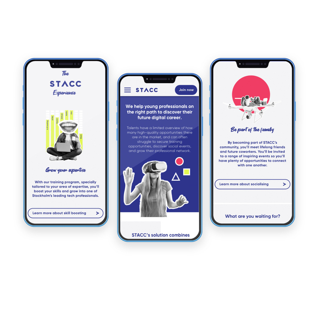
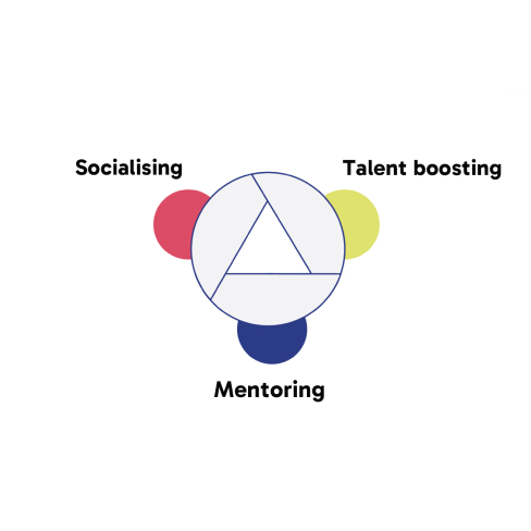
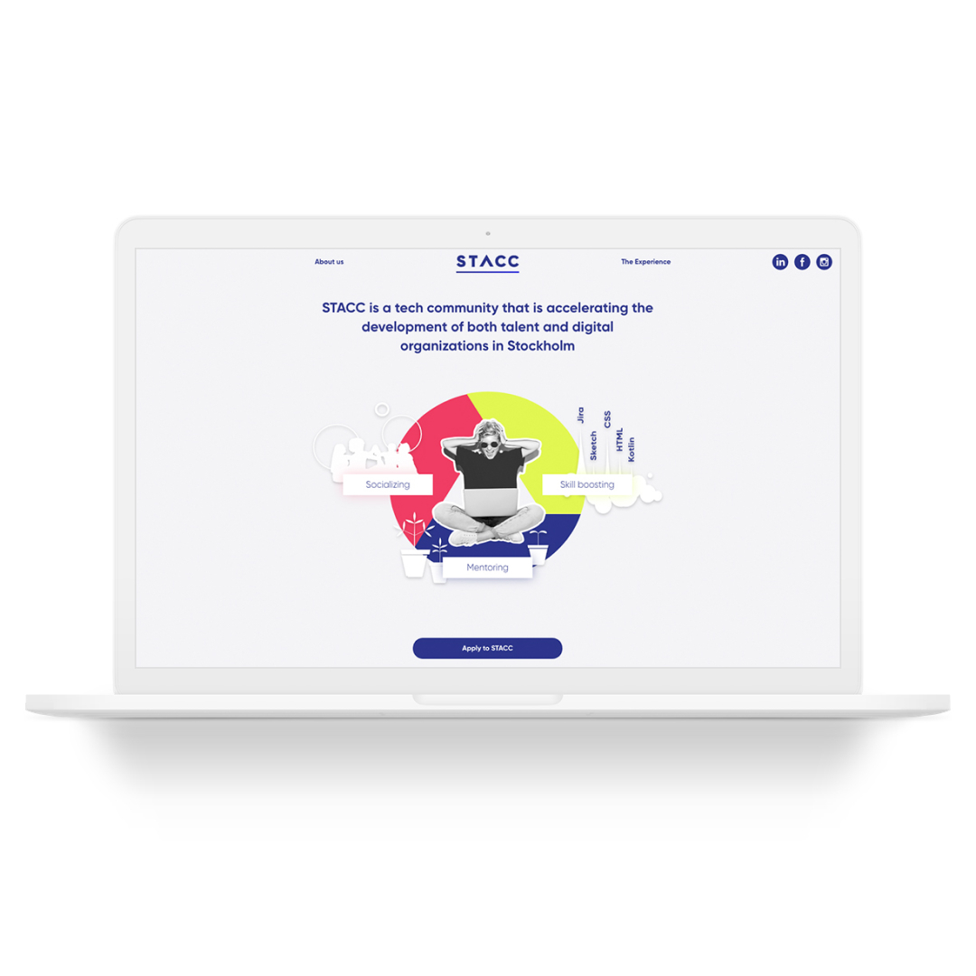
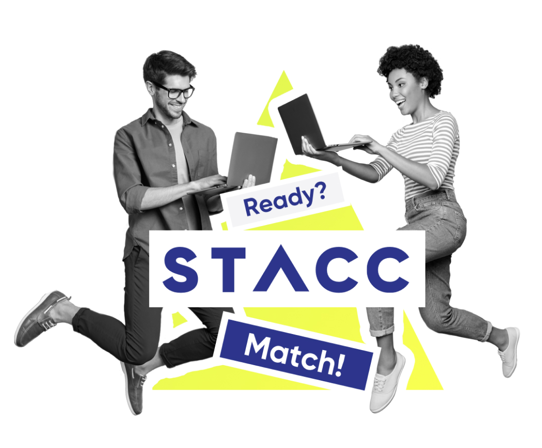
We were tasked with creating a digital solution and brand to promote the new 'STACC' talent matching service, facilitating the connection between emerging tech talents and potential companies or organizations seeking to recruit these rising stars for their in-house teams. STACC serves as the intermediary, establishing an even and fair playing field for both talent and companies.
The process involves a six-month education, mentorship program, and a test period where talents work on a consultant basis for the company. After this period, both parties decide if they are a good match, potentially leading to a full-time employment contract. The primary objective was to attract, educate, and convince talented individuals to sign up with STACC. The focus was on providing a seamless journey for the talent, particularly when connecting with the existing sign-up process through Team Taylor. This approach ensured a user-friendly experience, emphasizing the benefits of STACC's comprehensive talent matching service.
Design & process
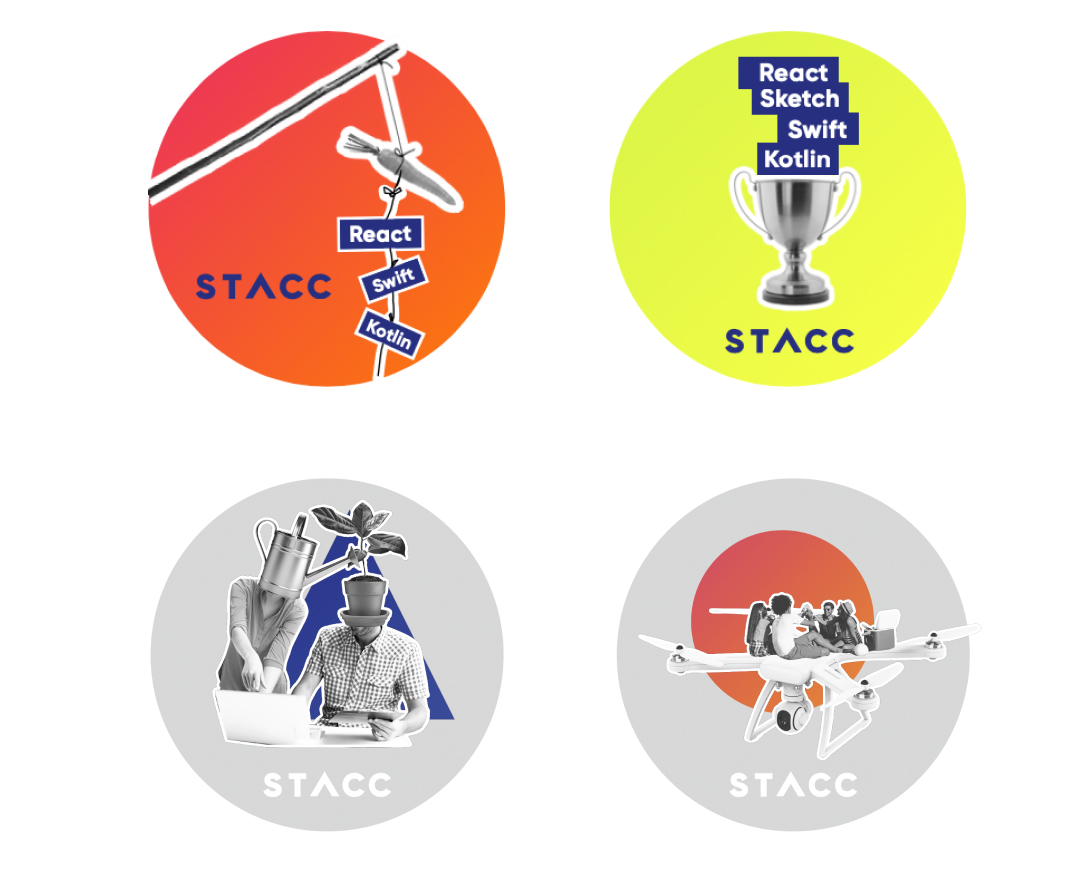
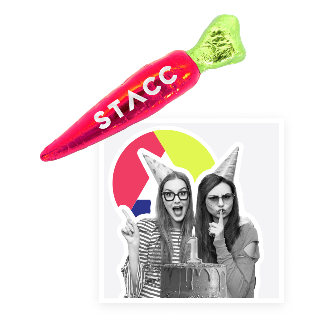
We initiated the project by conducting workshops with the client to gain a deeper understanding of their perceived target audience and business plan. This enabled us to formulate a strategy to define their tone of voice, mission, and market position. Based on these insights, we crafted a proposal outlining the visual look and feel of the brand identity. This included a distinctive illustration style to be implemented across all brand touchpoints, along with guidelines on how to use the identity. Additionally, we developed a brand story and context that were applicable to both digital and print mediums.
Throughout this process, we collaborated closely with the STACC team and tester groups of their 'talents' and prospects. Our goal was to create a visual identity that was relatable, fun, and informative. Drawing inspiration from current design trends and visual languages prevalent in the tech industry, we aimed to stand out in the competitive landscape of digital recruitment and tech acceleration hubs in the Stockholm market.
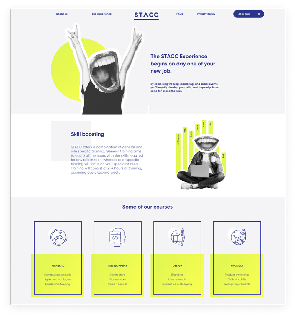
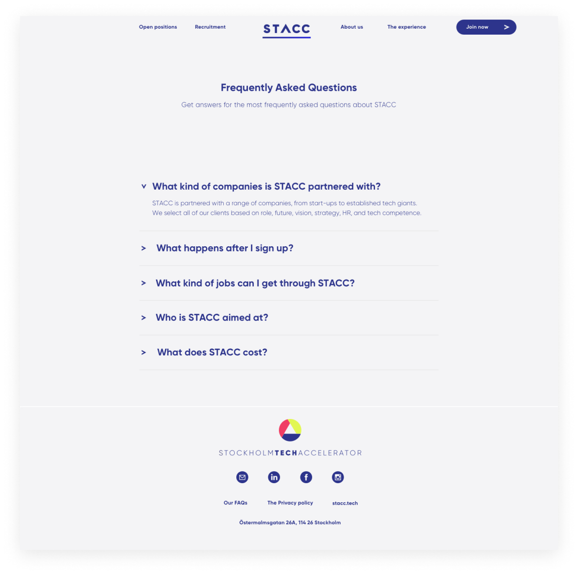
Utilizing UX design principles, we crafted a digital experience through a website that guided users in understanding the benefits of the 'STACC experience,' ultimately leading them to the call-toaction of signing up for a consultation. The UI design was aligned with the visual identity and assets, emphasizing strong typography and tone of voice.
Given the challenge of spreading the word about STACC, particular attention was placed on SEO, visuals, and metadata to ensure successful content dissemination across all online channels. This comprehensive approach aimed to establish a cohesive and effective online presence for STACC.
Role & responsibility
Product Design Lead / Name creation / Visual identity / brand story / Brand design & development / UI & UX website / wireframes / clickable prototypes / client and development team contact regarding design / pixel perfect sketch files / style guides / sendgrid email design (trigger emails) / UX copy for website.
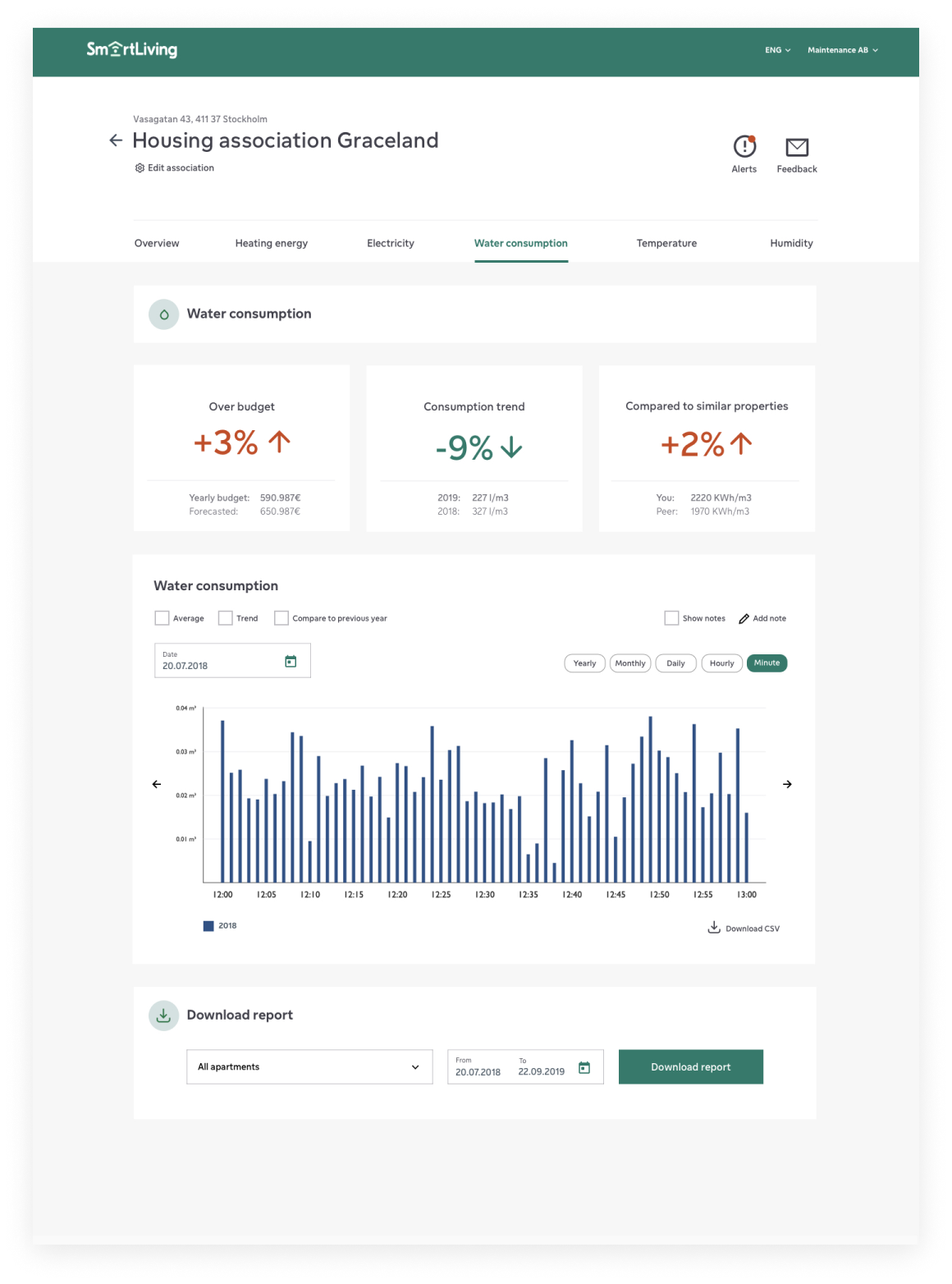
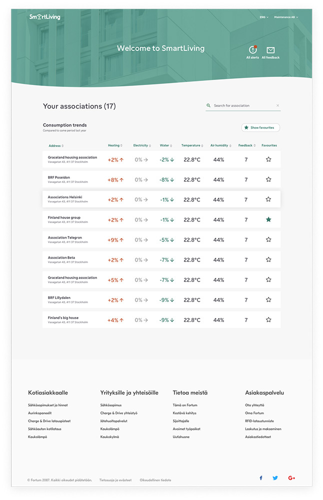
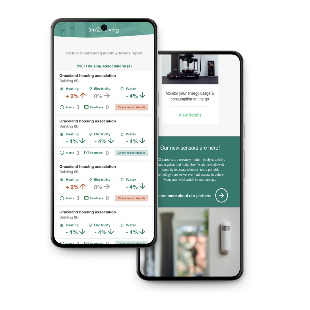
FORTUM - SMART LIVING - THE SMART HOME ALL IN-ONE SOLUTION FOR BUILDING ASSOCIATIONS, APARTMENT OWNERS AND TENANTS
About the product
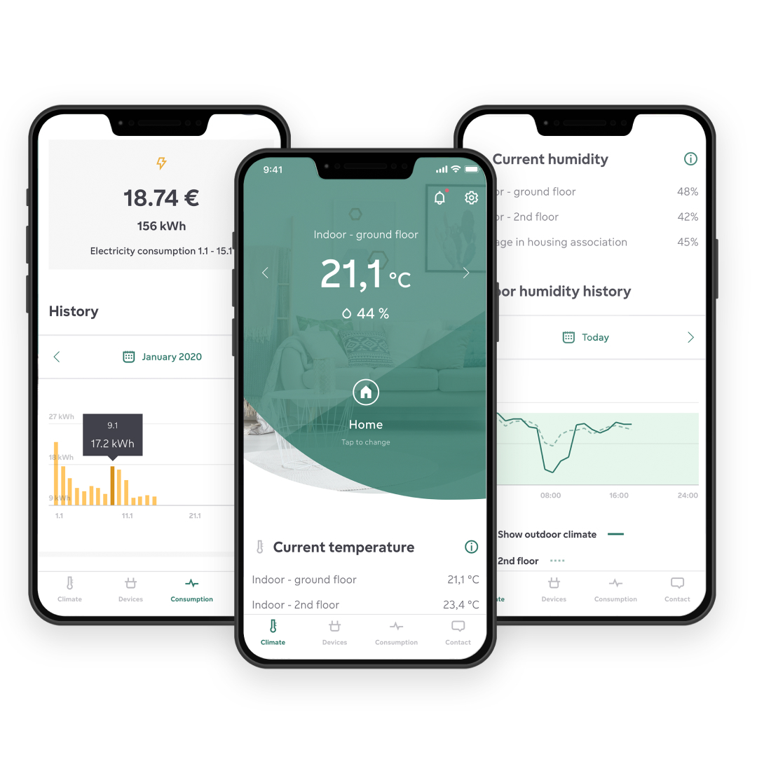
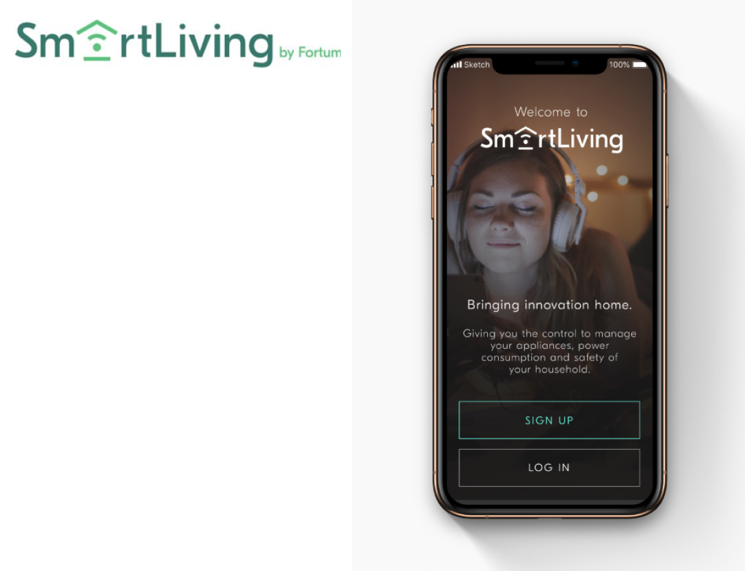
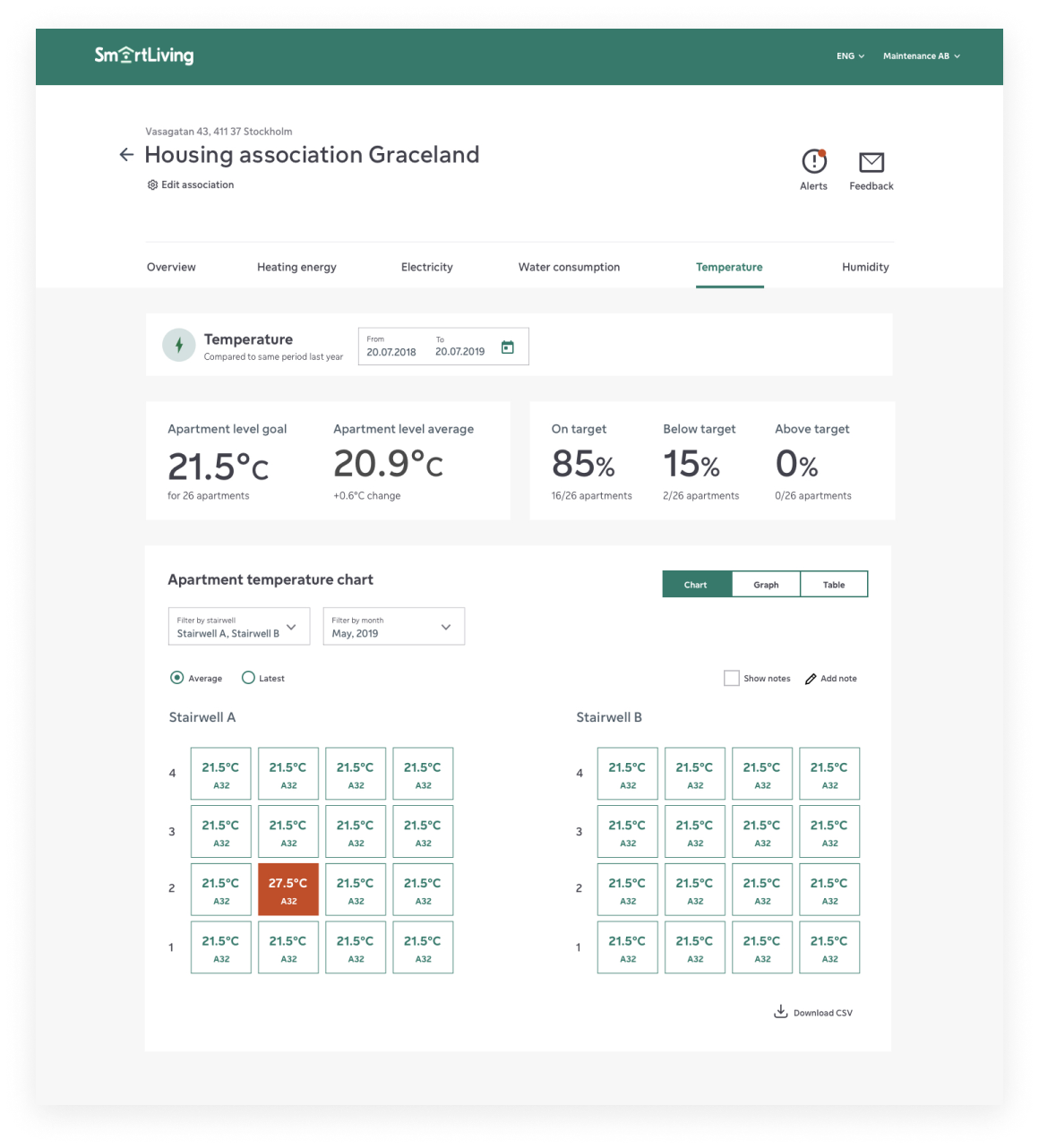
The Fortum SmartLiving app is your go-to hub for all things related to your home and building. Tailored to your chosen services, it allows you to effortlessly oversee your home’s indoor climate, monitor electricity and water usage, and manage all your smart devices and lights with a simple click. Moreover, the app provides a direct channel to communicate with your housing association and maintenance company, ensuring swift resolution of any issues or concerns.
a
The original design
Design & process
As a design consultant, I collaborated with the in-house team at Tingcore (a startup acquired by Fortum) and Fortum design team at Fortum HQ in Stockholm. Our joint efforts focused on the UX/ UI design for the Fortum Smart Living app and the housing association web platform. I played a key role in facilitating and creating prototypes for qualitative test sessions involving active users, as well as participating in on-site device tests.
The design approach for these products was highly user-centric and data-driven, incorporating continuous feedback and iteration loops.
Working closely with the UX research team, we collaborated on evolving the design and introducing new features for the existing apps, web platform, and the maintenance and updating of the Tingcore design system.
Role & responsibility
Product Design / UI & UX design apps and web platform / wireframes / clickable prototypes / client and development team contact regarding design / pixel perfect figma files / Design system design / qualitative and quatative testing / email design (trigger mails) / UX copy / art directing photoshoots
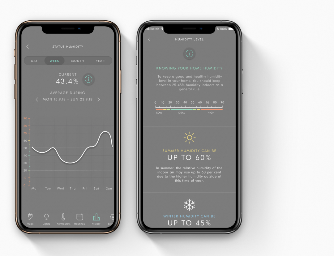
Additionally, we extensively explored research and testing related to data visualization, as well as the processes of visualizing and instructing the connection between digital solutions and physical hardware. This exploration enhanced our understanding and implementation of effective data visualization strategies within the products. This project was particularly interesting as it combined both digital products and hardware to capture relevant data for monitoring and remote regulation of energy and water consumption.
This integration of digital and physical components added a unique and challenging dimension to the design process, requiring a comprehensive understanding of both realms. Furthermore, I played a pivotal role in setting the visual style for the imagery used in all promotional materials for the products. This involved art directing photo shoots for product images and designing product-triggered emails and onboarding newsletters. These tasks added an enjoyable dimension to the project, ensuring that the visual elements aligned with the overall design aesthetics and effectively communicated the product features and benefits.
Monetoring & service update emails
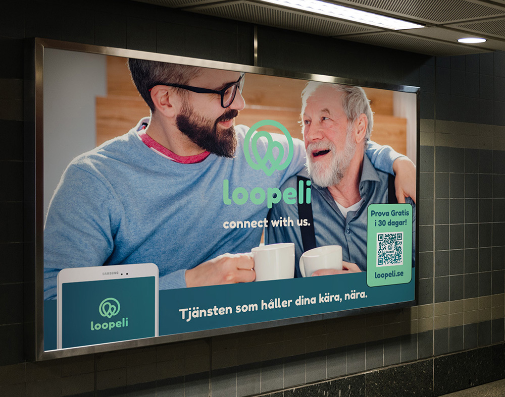
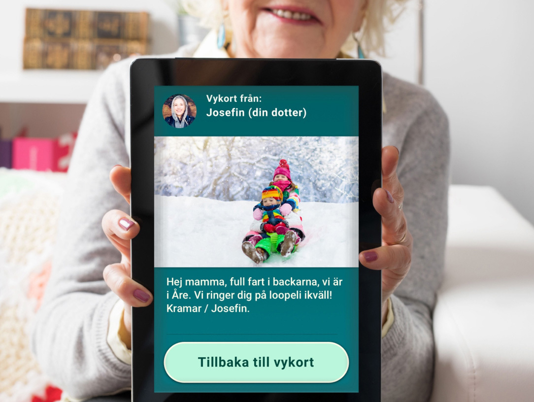
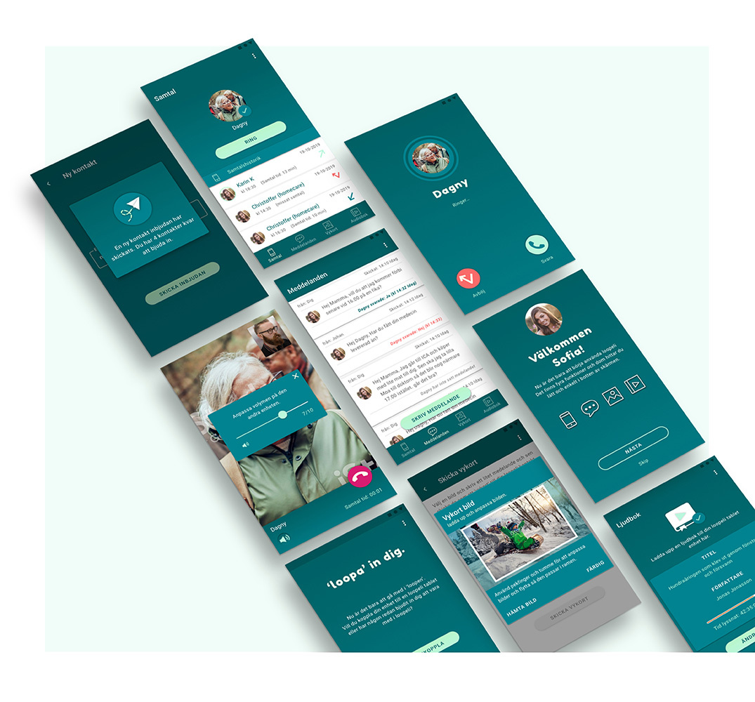
LOOPELI - A DIGITAL SERVICE BRINGING GENERATIONS CLOSER.
About the product
Our initiative was born out of the recognition that many elderly individuals today confront heightened isolation and the resulting sense of alienation. As digitalization and technology continue to advance, an increasing number of elderly people face challenges in using modern communication tools. With the overarching objective of fostering connection across generations, spreading joy, and enhancing security, we embarked on a mission to address these issues.
Collaborating closely with the concept owner, our team played a pivotal role in developing the brand identity and user experience. This encompassed the design process, where we leveraged research, digital expertise, and technical know-how to identify and create a digital solution that effectively addressed the challenges at hand. This comprehensive approach aimed to bridge the generation gap, providing a solution that not only aligned with the needs of elderly individuals but also catered to the broader goal of fostering intergenerational connection and well-being.
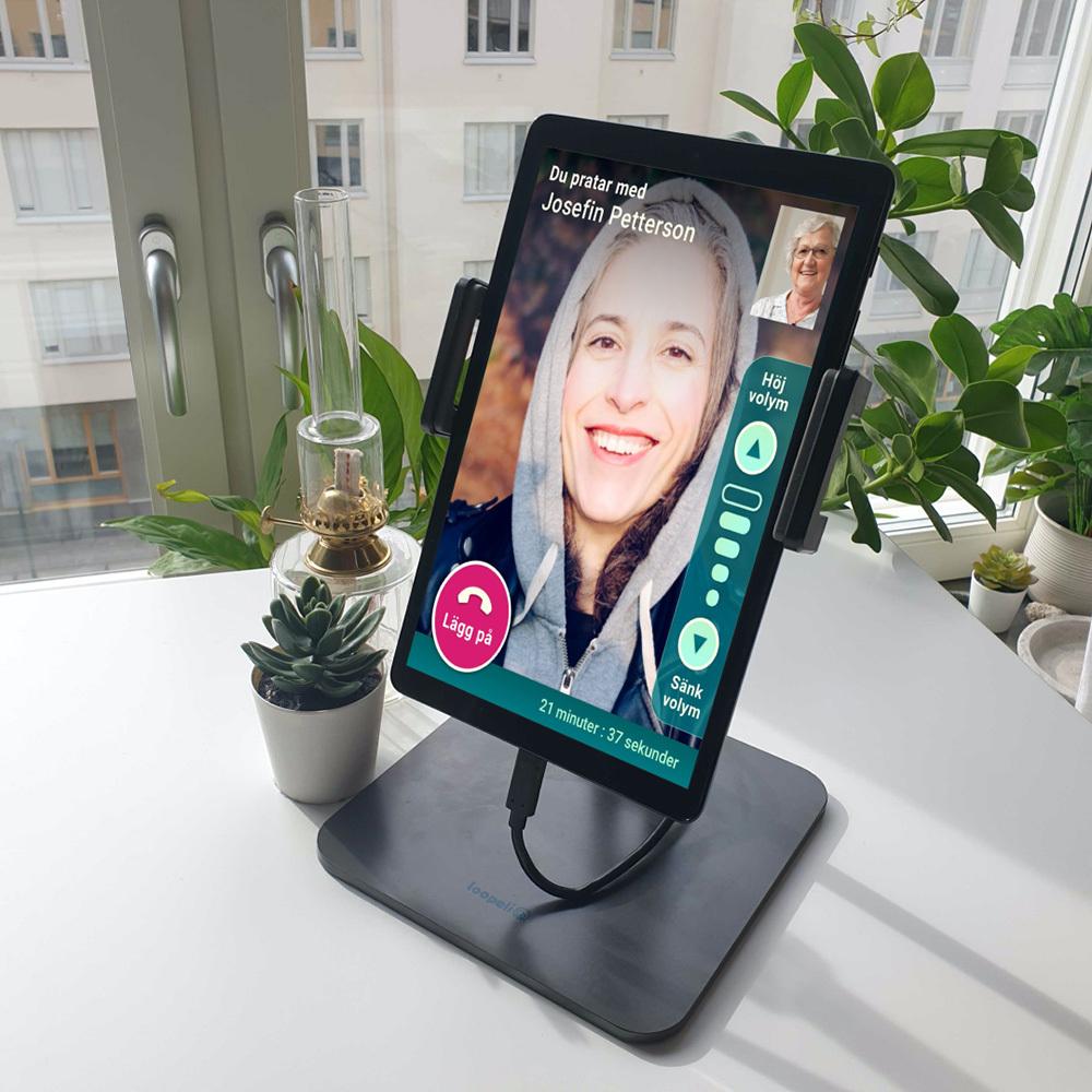
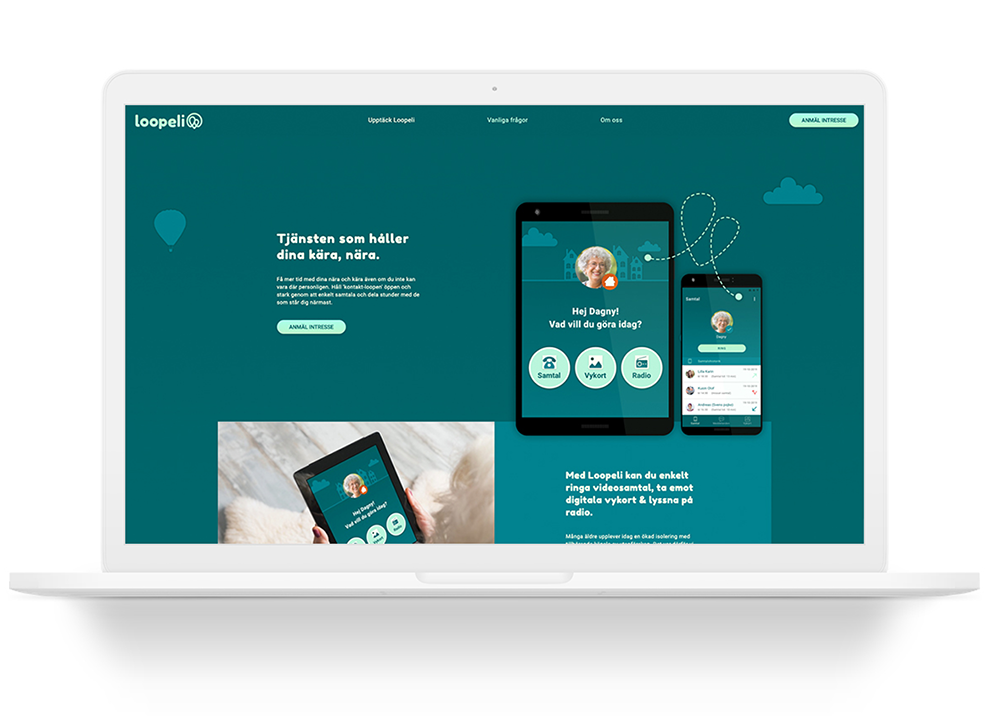
With the Loopeli platform the conversation is always open and the family loop is always circling, keeping the bond strong within the family. This allows for all to be heard and seen, even when there might not be a physical presence. Simply keeping the family a top priority.
It let's families 'share the care' creating a very strong unified support network for loved ones. The name is easy to say and combining the loop and taking aspects of the German word for family. 'Loopeli' is genuine, playful and 'techy' yet simple.
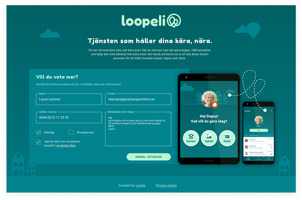
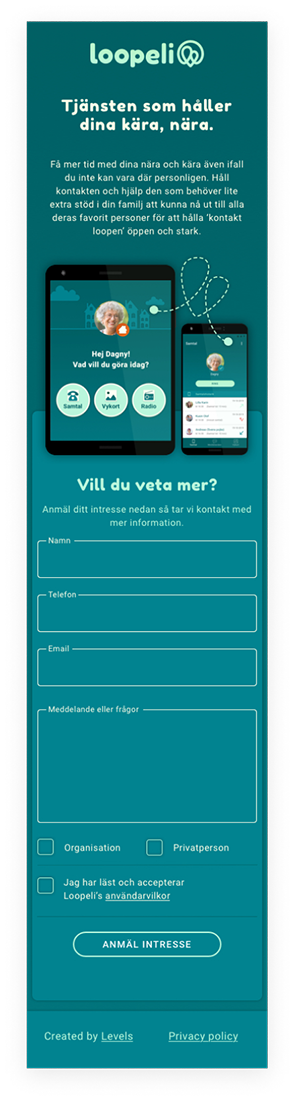
Holding page & interest registration
Role & responsibility
Product Design Lead / Name creation / Brand design & development / UI & UX design native apps and promotional website / wireframes / clickable prototypes / client and development team contact regarding design / pixel perfect sketch files / style guides / visuals for appstore, googleplay, meta data / UX copy for app / Mentoring and guiding junior designers in the project.
ELLSKA - A SAAS ECOMMERCE PLATFORM FOR HANDMADE GOODS CREATED LOCALLY IN SWEDEN
About the product
Ellska.se, a SaaS platform startup launched in 2021 by myself and my partner, operates as a '2-man-band,' where I oversee and take responsibility for all aspects of product design, brand strategy, and marketing.
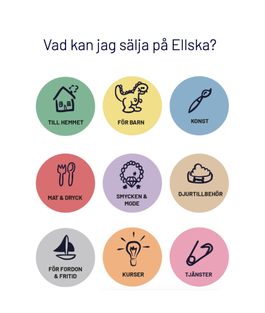
The product itself addresses a gap in the Swedish market, positioning itself in competition with giants like Etsy or Tradera. Ellska stands out as a more local and personal platform that places value on local creators, small businesses, and sole traders. The goal is to become the go-to SaaS platform in Sweden for all handmade products infused with passion and creativity.
For creators wishing to sell on Ellska, we offer a selection of boutique subscription options or the choice of selling 'one-off' creations. The brand name is derived from the Swedish word 'älska,' emphasizing the notion that the majority of handmade products are crafted with love and a dedication to the creative process.
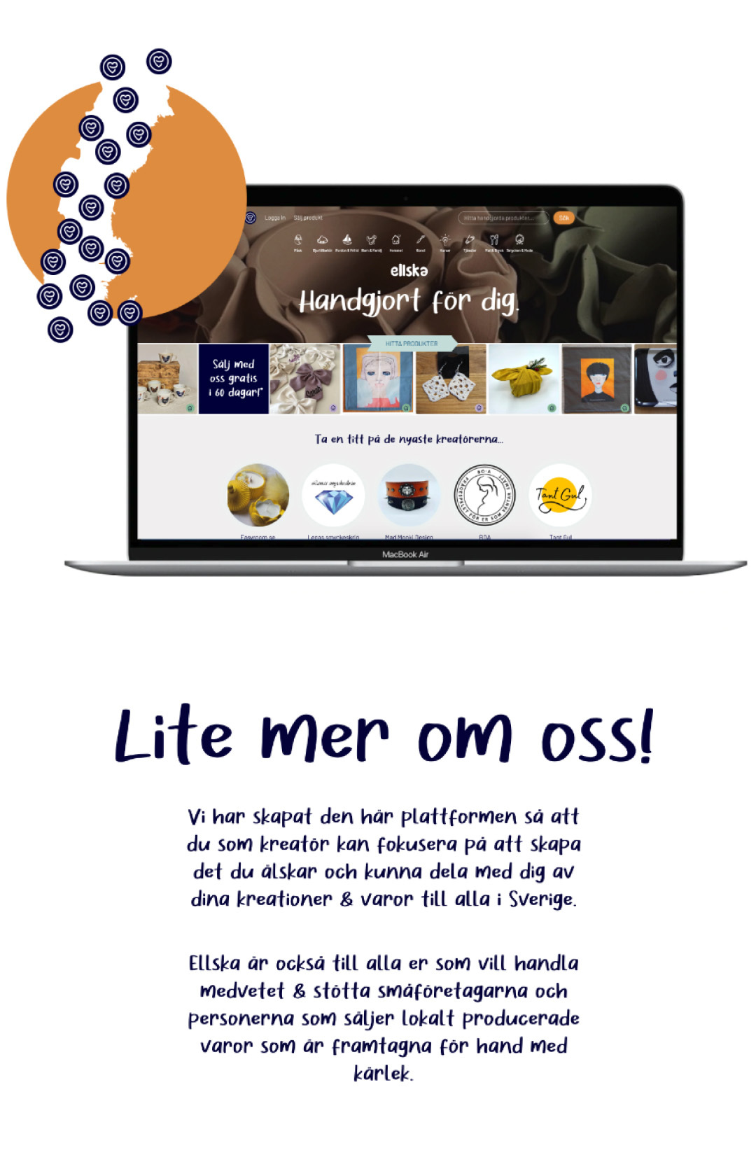
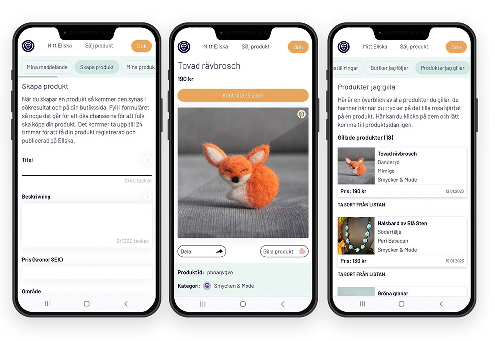
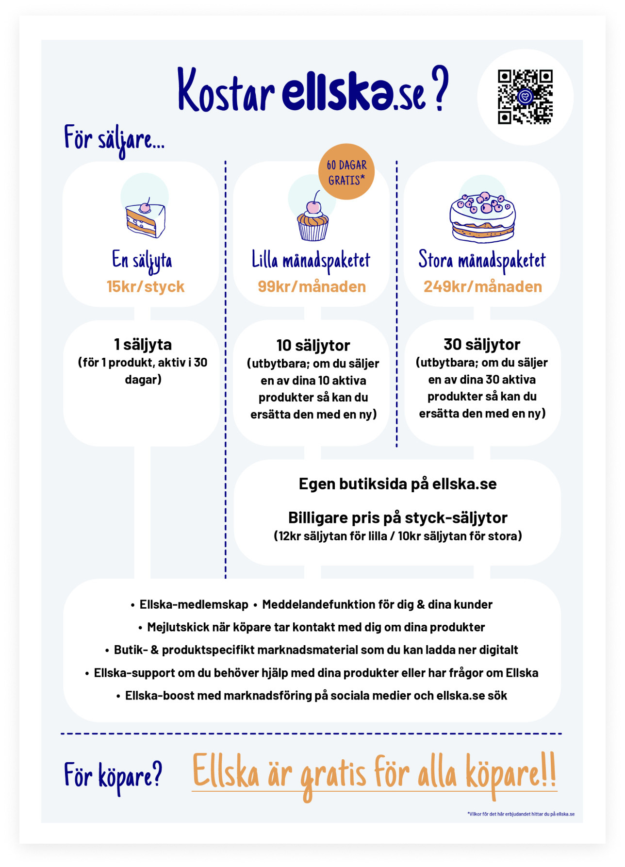
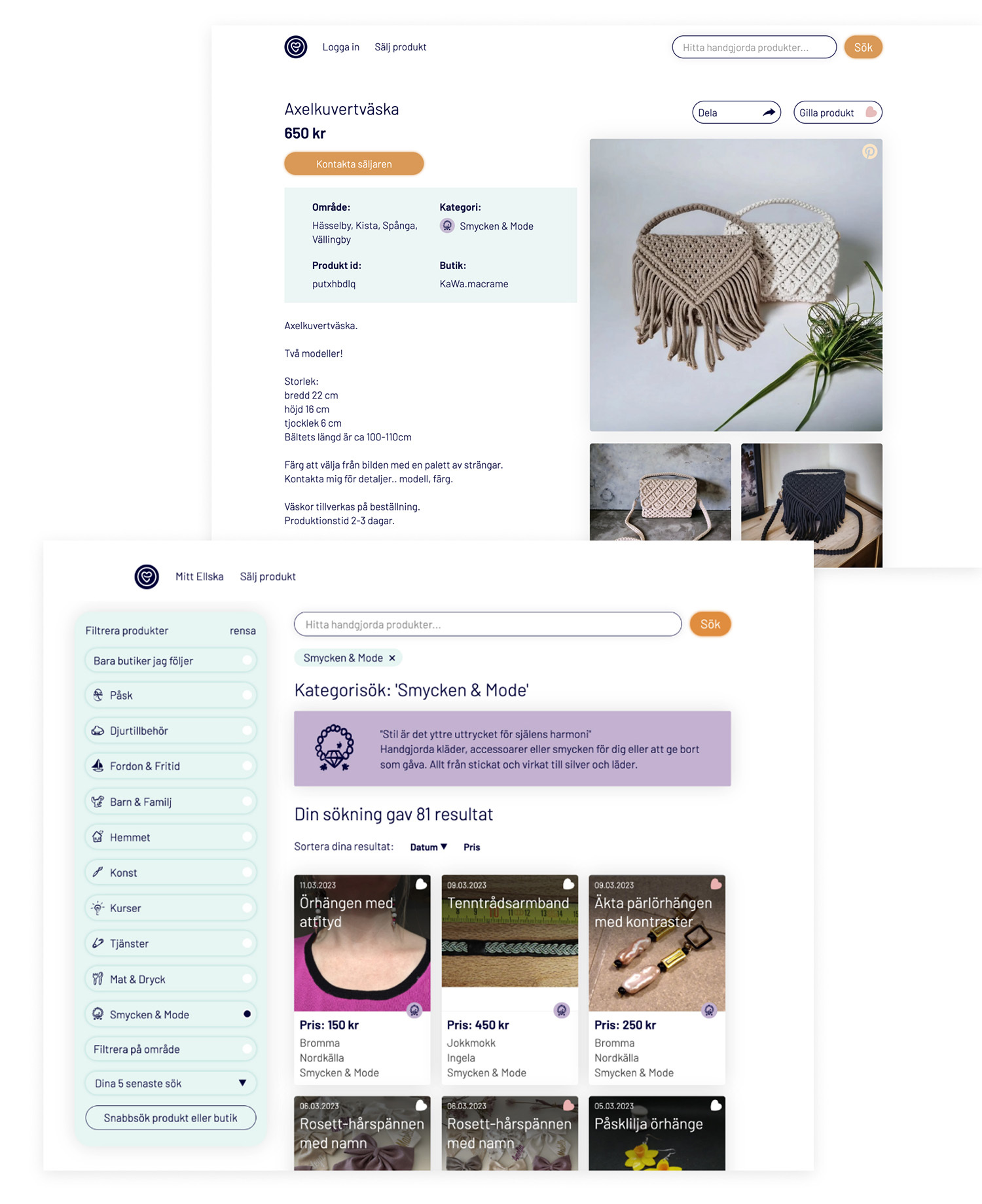
The platform's design focuses on simplifying the technical process of adding products to shops or setting up accounts, ensuring user-friendliness for all tech abilities within the target user group. The visual language adopts a creative, informative, and motivational tone to elevate the products and individual sellers on the site.
Presently, we attract approximately 3000 new unique visitors each month. As our next feature, we are aiming to enhance the SaaS platform by integrating a payment system through Stripe and Swish, further lowering the threshold for purchases. Additionally, we plan to develop an Admin app for sellers to streamline their experience on the platform.